Easily plot euler diagrams
Examples
data.frame(
A = sample(c(TRUE, TRUE, FALSE), 50, TRUE),
B = sample(c("A", "C"), 50, TRUE),
C = sample(c(TRUE, FALSE, FALSE, FALSE), 50, TRUE),
D = sample(c(TRUE, FALSE, FALSE, FALSE), 50, TRUE)
) |> plot_euler("A", c("B", "C"), "D", seed = 4)
#> Error in purrr::map(p, p, function(.x) { out <- .x if (isTRUE(x.axis)) { out <- out + ggplot2::xlim(xr) } if (isTRUE(y.axis)) { out <- out + ggplot2::ylim(yr) } out}): ℹ In index: 1.
#> ℹ With name: FALSE.
#> Caused by error in `pluck_raw()`:
#> ! Index 1 must have length 1, not 11.
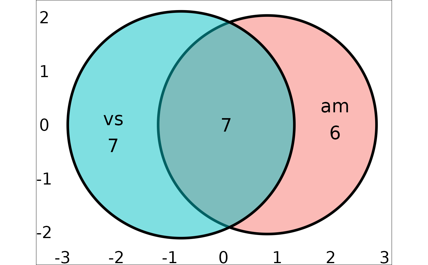
mtcars |> plot_euler("vs", "am", seed = 1)